Repainted my kitchen cabinets twice in two years. First time badly. Second time right. Everything I know about blue kitchens came from one expensive mistake and a lot of YouTube.
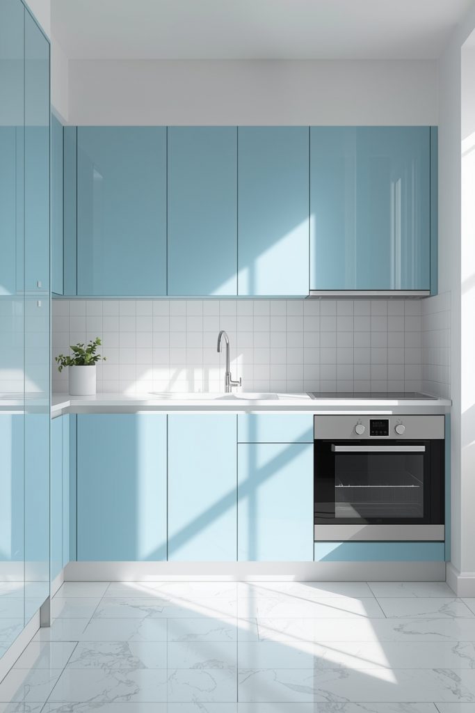
The first shade of blue I put on my kitchen cabinets was called “Midnight Isle.” I found it on a sample card at the hardware store under fluorescent lighting and it looked like a deep, moody navy. I took it home, painted the lower cabinets, finished around 8pm, switched on the kitchen light, and stood in the doorway staring at what I’d done. It wasn’t navy. Under my overhead lighting it had gone almost black. My wife walked in behind me and said “oh, wow” in the tone of voice that means the opposite of wow.
I lived with it for five months. Then I sanded everything down and started over with a shade I’d actually tested on a real cabinet door in my real kitchen at three different times of day. The second version — Benjamin Moore Hale Navy — looked completely different from Midnight Isle even though both claimed to be navy on the chip. That five-month lesson is the most useful thing I can pass on before we get into the ideas.
These 19 blue and white kitchen ideas cover every version of this combination worth considering. I’ve kept paint brand names and US dollar costs throughout because “affordable” and “budget-friendly” tell you absolutely nothing useful when you’re standing in a hardware store trying to figure out what to buy.
Test the shade before you buy a gallon — here’s why this matters
Paint looks different in a store than it does in your house. That’s not a complaint about paint — it’s physics. Fluorescent store lighting has a color temperature around 4000–5000K. Your kitchen probably runs 2700–3000K, which is much warmer. A shade that reads as a clean navy under store lights can shift toward black or towards grey-blue entirely under your own fixtures.
Buy sample pots first — Benjamin Moore and Sherwin-Williams both sell samples for $4–$6. Paint a piece of cardboard or directly on a cabinet door. Look at it in the morning, around noon, and again at night with your usual lights on. What you see during those three checks tells you more than any color chip. I skipped this step the first time. I spent five months with a black kitchen.
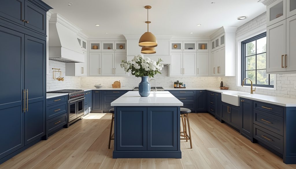
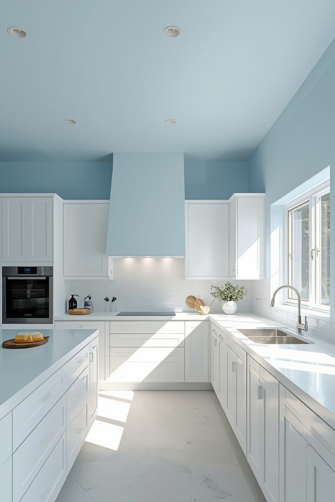
THE 60-30-10 SPLIT FOR A BLUE AND WHITE KITCHEN
- 60% white: Walls, ceiling, upper cabinets — white pushes light outward and keeps the space from feeling enclosed
- 30% blue: Lower cabinets, kitchen island, or a feature backsplash — this zone carries your color decision
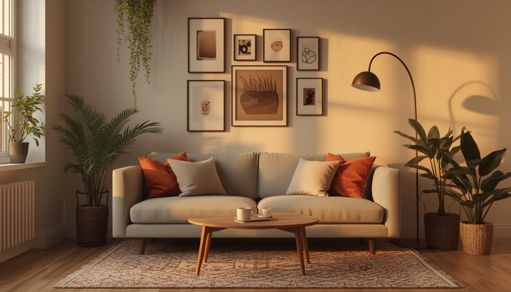
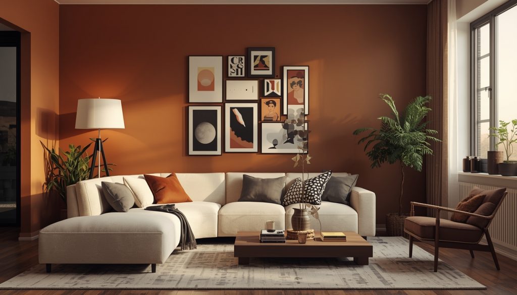
- 10% warm accent: Brass hardware, wooden stools, woven mat — small amount, disproportionate payoff in making the room feel settled rather than cold
Skip that 10% warm element and most blue and white kitchen setups feel slightly clinical. The whole thing depends on that grounding accent more than most people expect until they see a kitchen that’s missing it.
19 blue and white kitchen ideas that actually work
These aren’t just visual ideas — each one includes a practical note so you know when it works and when it doesn’t.
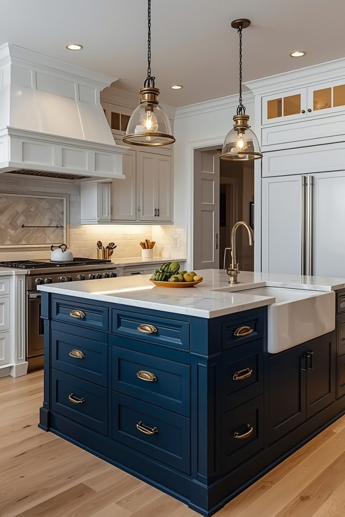
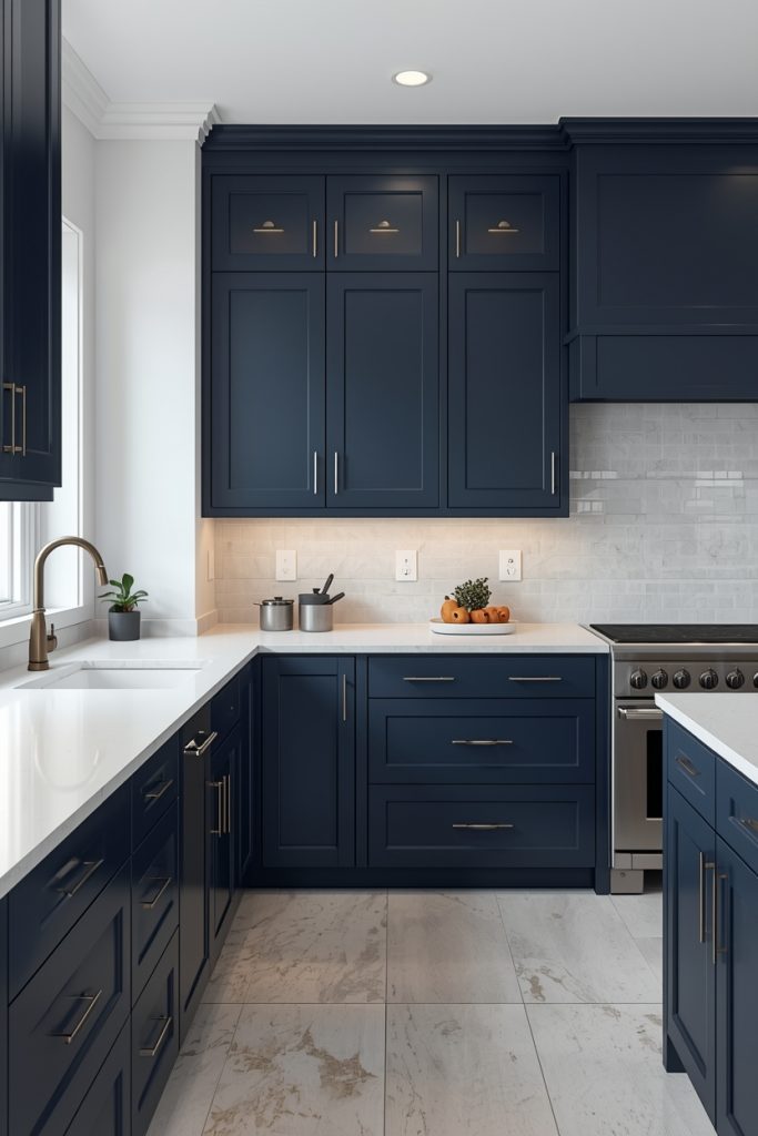
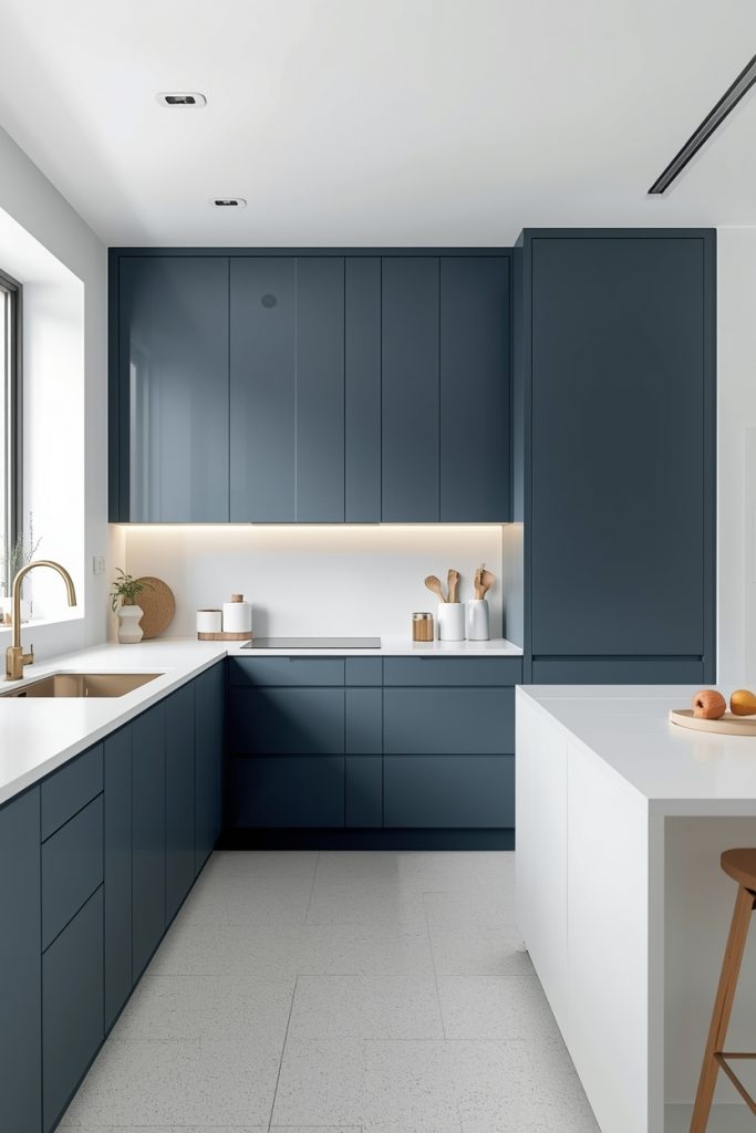
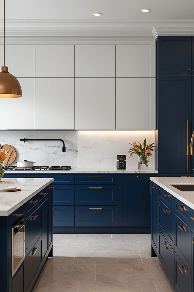
01- Navy lowers, white uppers
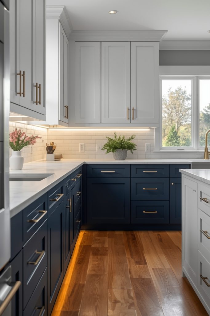
After my Midnight Isle situation, I landed on this combination for attempt two — navy lower cabinets, white upper cabinets — and the difference was night and day. Literally. Under my kitchen’s warm lighting the room finally felt settled and intentional rather than like I’d made an error I hadn’t figured out how to fix yet.
Benjamin Moore “Hale Navy” (HC-154) runs about $65–$75 per gallon and dries to a rich, slightly green-toned navy that photographs well and holds up to daily use in their Advance cabinet formula. Sherwin-Williams “Naval” (SW 6244) sits in the same family — about $58–$68 per gallon — and leans fractionally warmer, which helps in north-facing kitchens where cooler light is a constant issue. Both shades read as proper navy rather than the near-black my first attempt produced.
Hardware selection changes the whole mood of this combination. Brushed brass pulls on the navy lower cabinets and simple chrome on the white uppers keeps the two zones talking to each other instead of sitting in separate design conversations. And a $35–$55 LED strip kit under the upper cabinets — the kind that throws warm light across the countertop — does more for evening atmosphere in this kitchen style than almost any other single addition.
02- Pale blue all-cabinet look
My sister has a small galley kitchen — maybe 90 square feet including the eating area — and she painted every cabinet the same pale powder blue. I told her the contrast-free approach would make it look flat. She ignored me and it ended up being the best-looking kitchen of anyone in our family. The single-tone approach stops the eye from dividing the room into upper and lower halves, so a tight kitchen reads as one cohesive space rather than two competing zones.
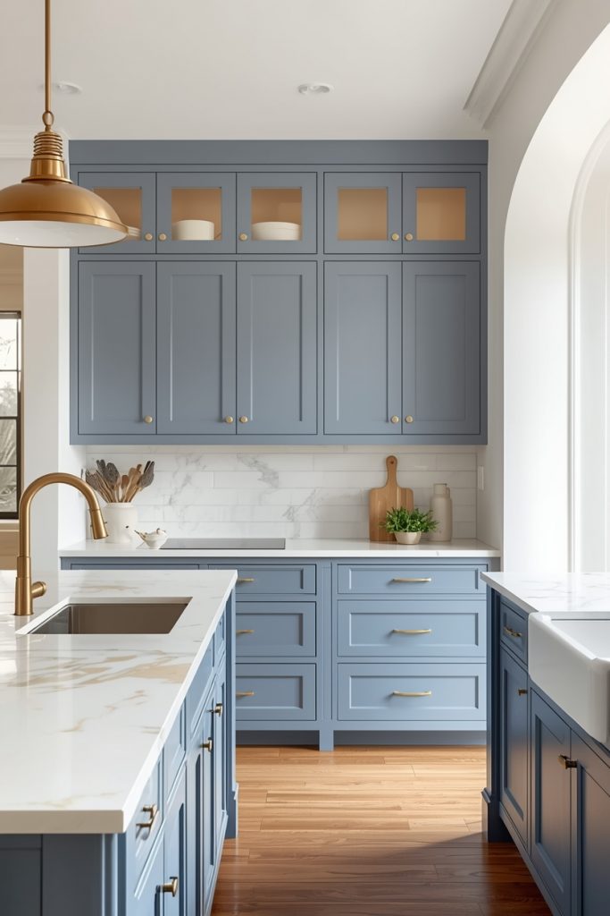
The critical word here is pale. This doesn’t work with saturated or dark shades across every cabinet surface — that just feels heavy in a small room. Farrow & Ball “Lulworth Blue” runs about $110 per liter and delivers an incredibly nuanced blue-grey that shifts subtly with daylight throughout the day. If that price point isn’t practical, Behr “Reflecting Pool” at around $35 per gallon at Home Depot sits in a similar soft territory for less. Benjamin Moore “Boothbay Gray” (HC-165, about $65/gallon) leans slightly greyer and suits rooms with warmer natural light.
White walls, white ceiling, and a high-gloss white tile backsplash push reflected light back into the room from every direction around the cabinets. Brass knobs at $3–$6 each finish the look without complicating it — this is one idea where fewer details genuinely produce a cleaner result.
03- Bold blue island only
A colleague at work did this last spring — painted just her kitchen island a deep cobalt while leaving everything else white — and sent me a photo that I genuinely thought was a professional kitchen shoot at first. One island. One bold color. The surrounding white made it pop instead of compete with anything. And since she only painted the island, the total paint cost was one quart: about $20–$35 depending on brand and finish.
Going bolder on a contained piece like an island makes sense precisely because it doesn’t dominate the whole room. Shades that would feel aggressive across 30 linear feet of cabinetry — deep cobalt, rich cerulean, vivid teal — work well across four sides of a 4-foot island because the surrounding white absorbs the intensity. If the color stops working for you in a few years, sanding and repainting one island is a weekend job rather than a whole-kitchen project.
Hardware on the island needs to do specific work here. Without a deliberate pull style, a painted island can look like a piece of furniture someone dragged in from another room. Four to six drawer pulls in antique brass or warm gold — $8–$15 each at Rejuvenation or Amazon’s hardware section — signal that the island’s color was a decision, not an accident. The pulls cost $50–$90 total and change everything about how the island reads in the room.
04- Coastal blue with raw wood
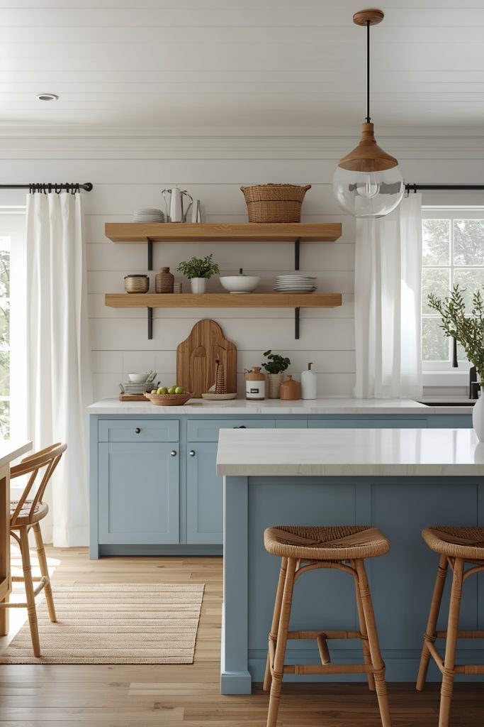
Blue and raw wood together do something that blue and white alone doesn’t quite manage — they bring warmth into the color palette from the material itself rather than relying on accessories to do that work. The grain of oak or walnut shelf wood pulls the cool maritime quality of the blue toward something earthier. Less yacht club, more beach cottage where someone actually lives.
Practically, this usually means blue painted lower cabinets with raw wood open shelving in place of upper cabinets. IKEA’s BROR shelving units run $80–$120 each and wall-mount in a couple hours with basic anchors. Butcher block countertops from Lumber Liquidators cost $30–$55 per square foot installed — substantially cheaper than stone and visually warmer alongside blue cabinet paint. For rooms where removing upper cabinets sacrifices too much storage, one section of open wood shelving flanking the window or beside the hood fan gives the same tonal effect without gutting the whole upper run.
Sherwin-Williams “Tradewind” (SW 6218, about $65/gallon) hits the right note here — muted enough to sit beside warm wood without the combination looking like a sailing school uniform. Straight saturated navy against raw red oak specifically clashes; the orange tones in the wood fight the cool undertone of the blue. If your kitchen has red oak floors or shelving, a grey-leaning blue or a dusty denim shade bridges the gap far better than a pure navy.
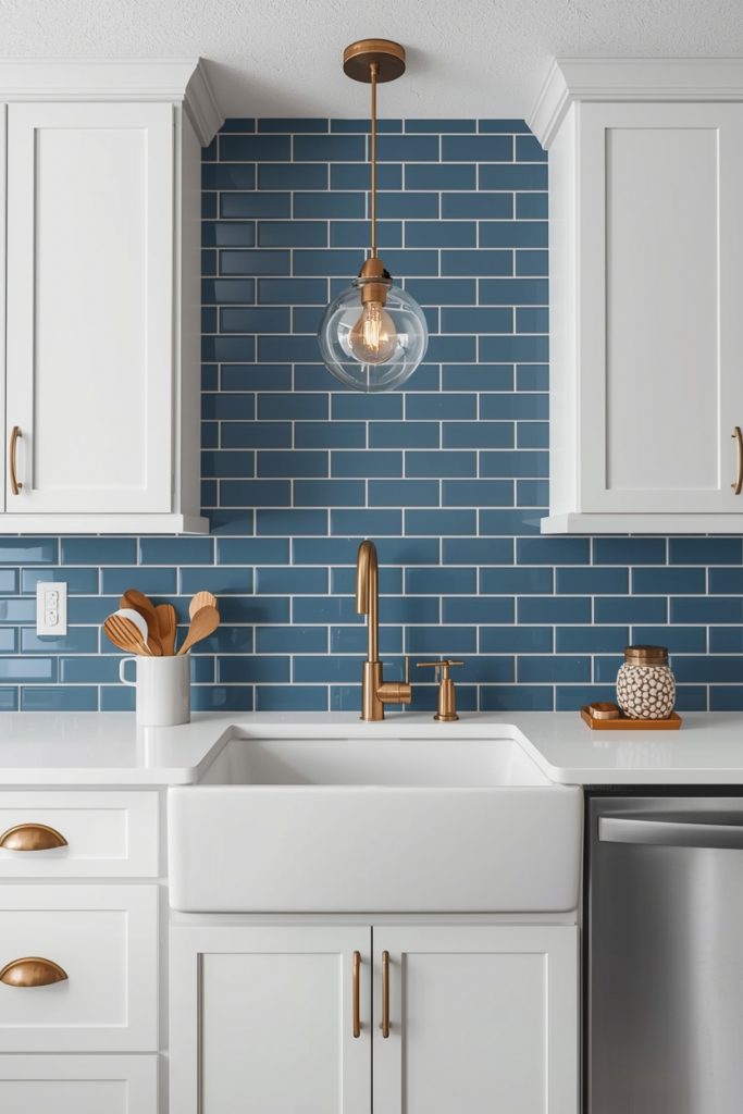
05- Blue patterned tile backsplash
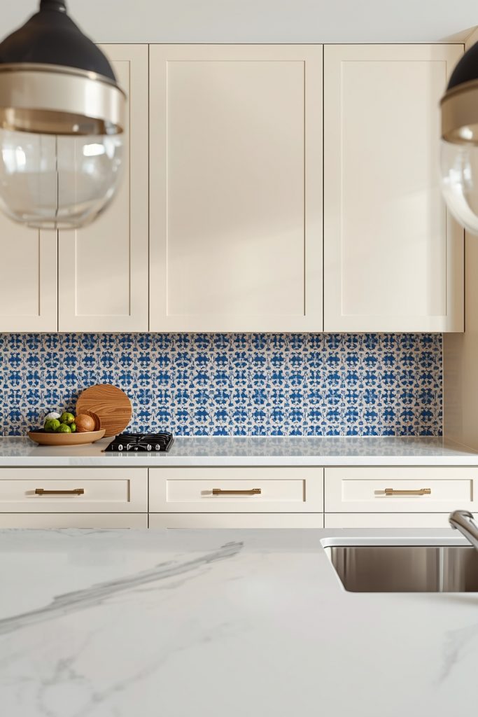
We rent our current house, so the cabinet painting options are limited. Last year I sourced about 18 square feet of hand-painted Talavera tiles from a small importer on Etsy — $4 per tile, deep cobalt pattern on white — and had them installed behind the stove and sink. The landlord approved it as a temporary installation since Talavera tiles come off without much drama. The kitchen went from a generic white box to something with genuine character and the only color came from $72 worth of tile.
Moroccan cement tiles in blue-and-white patterns run $8–$18 per square foot at specialty tile retailers. Handmade Talavera tiles come in around $2–$6 per tile from distributors and online importers. An average kitchen backsplash of 15–25 square feet costs $120–$450 depending on tile quality, plus installation labor at $8–$15 per square foot if you hire someone rather than doing it yourself. For renters or anyone who wants reversible color, this approach avoids the cabinet painting conversation entirely.
White cabinets work best alongside a patterned blue backsplash because they don’t compete with the tile’s visual activity. Any color in the cabinet run fights with the pattern and the whole backsplash starts to look busy rather than deliberate. Bright white grout keeps the design crisp — grey grout muddies the contrast between tile colors and dark grout makes the grid lines compete with the pattern itself.
You may also like: 15 Kitchen Decor Ideas in 2026 for a Modern and Stylish Home.
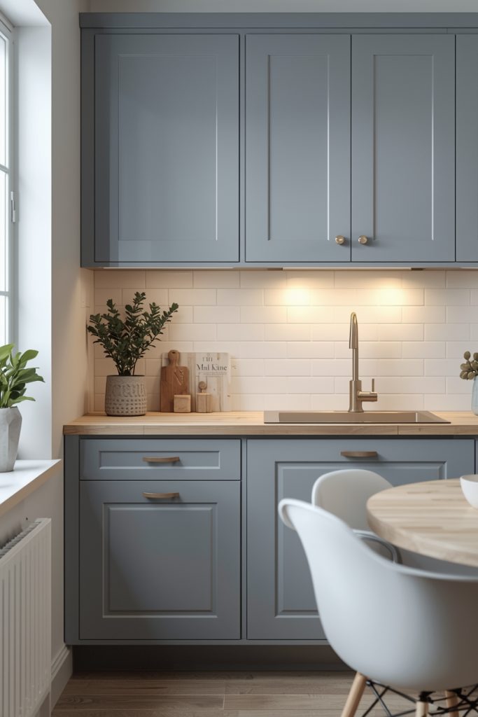
06- Matte dark blue cabinets
The same navy in satin finish and in matte finish are functionally two different colors in a kitchen. Satin reflects the overhead light and reads formal — almost corporate. Matte absorbs the light and reads textural, dimensional, and genuinely contemporary. If you’ve looked at dark blue cabinet inspiration online and thought it looked flat or glossy-in-a-bad-way, the finish was probably satin when matte would have solved it.
Benjamin Moore “Van Deusen Blue” (HC-156) in their Aura Matte formula runs $78–$88 per gallon and dries to a rich slightly green-navy with real depth in person. Sherwin-Williams “Anchors Aweigh” in Emerald Matte costs $72–$82 per gallon and pulls slightly cooler. Both shades need a cabinet-specific formulation rather than standard wall paint — wall paint scratches off cabinet edges within a few months of regular use regardless of how carefully it goes on.
White walls above matte dark cabinets stop the kitchen from feeling oppressive. Keep the countertop light — white quartz, pale grey honed stone, or bright subway tile behind the range — so the upper half of the room stays open and the dark cabinet tone stays grounded below where it belongs. Matte black bar pulls at $8–$15 each from hardware stores or Amazon bring consistency without adding visual noise to an already bold cabinet color.
07- Open shelves with blue pottery
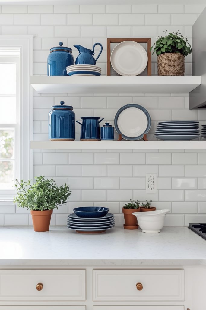
My mother-in-law pulled the doors off her two upper corner cabinets one Saturday — they’d been annoying her for years because they swung into the walkway — and styled the open shelves with her collection of blue-and-white transferware she’d been buying at estate sales for two decades. The kitchen went from perfectly ordinary to genuinely interesting without her spending a dollar or touching a paintbrush. The collection did all the work.
Blue-and-white ceramic pieces show up at thrift stores and estate sales for $1–$8 per piece. Anthropologie and World Market carry newer stoneware in blue tones for $12–$45 per item. IKEA’s ceramic storage jars in white with blue graphic patterns run $5–$12 each. The specific source matters less than the consistency of shade — buy pieces in the same family of blue and they read as a collection. Buy pieces in five different shades and they just look like overflow storage given some shelf space.
An overcrowded open shelf defeats the whole approach. Stack white plates on the lower shelf position, set two or three blue ceramic pieces at different heights in the middle section, and leave some space deliberately clear. The gaps give the pieces room to register as chosen objects rather than accumulated clutter. Closed cabinets hold everything else. Open shelves hold only what earns the display.
08- Soft blue with marble counters
Pale blue cabinet paint alongside white marble produces a combination that shows up in expensive kitchens not because either material costs a fortune necessarily but because the two cool tones interact in a very specific way. The warm grey veining in the marble cuts through the coolness of the blue and adds depth to both surfaces. Neither material looks quite as good without the other in this pairing. Together they produce something that looks genuinely considered.
Real Carrara marble countertops run $40–$100 per square foot installed — a full kitchen counter runs $3,000–$8,000 depending on size and edge profile. MSI Calacatta Laza quartz and Cambria Brittanicca both mimic warm-veined marble convincingly at $55–$85 per square foot installed, resist staining without sealing, and don’t etch when citrus juice or vinegar hits them the way real marble does. For a kitchen that sees regular cooking use, the quartz alternatives are more practical even if the real stone is more satisfying.
A grey-blue like Sherwin-Williams “Sea Salt” (SW 6204, around $65/gallon) pairs with warm-veined marble more naturally than a pure bright blue does. The grey undertone in that shade picks up the grey veining in the stone and creates a visual connection between the two surfaces that keeps the palette from reading as two separate design decisions placed next to each other.
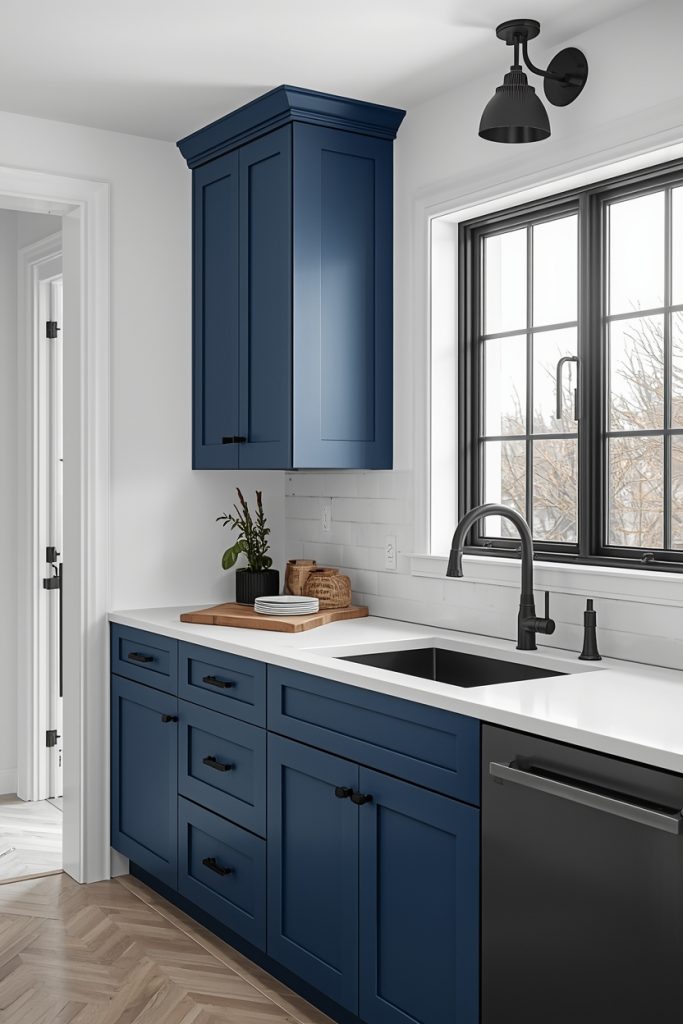
09- Blue cabinets with brass hardware
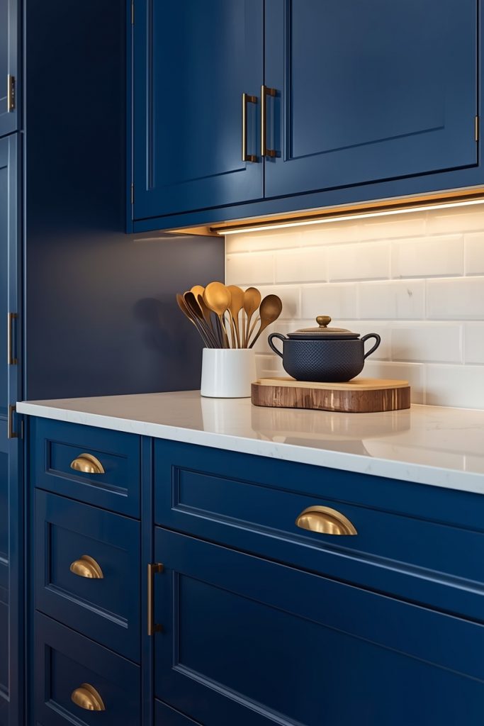
The first version of my navy kitchen had chrome hardware. I kept feeling like something was slightly off even on days when the light was good and the color looked right. A friend who does interior design work visited and within thirty seconds identified the issue — the chrome was adding another cool element to a kitchen that already ran cool, and the room had nothing warm in it at all. Swapping twelve cabinet pulls from chrome to brushed brass ($22 each from Rejuvenation, so $264 total for the full kitchen) changed the whole character of the room. Same color, same layout, completely different feeling.
Unlacquered brass develops a patina from daily contact — hands, steam, cleaning — and the aged quality ends up looking more deliberate than the original bright finish. Lacquered brass holds the shine longer but can look slightly artificial next to matte or aged cabinet finishes. If the budget is tight, Amazon’s unlacquered brass pulls in simpler bar and cup styles run $8–$15 each and provide the same warm metal quality for considerably less per pull.
A brass faucet tied into this same palette — Kingston Brass and Kohler both carry solid options at $150–$400 depending on style — anchors the sink area in the same warm metal language as the hardware. The combination of navy cabinets, brass faucet, and a white apron-front sink is one of the most referenced kitchen pairings on Pinterest for good reason. It genuinely holds together.
Watch for clashing undertones: Brass works well alongside blues with warm or neutral undertones — denim blue, aged navy, dusty slate. Put it beside a very green-leaning blue like aqua or cyan and the two warm-cool tones fight each other. Hold a brass swatch next to your paint chip in natural light before committing to both.
You may also like: 15 Modern Kitchen Cabinet Ideas in 2026
10- Flat-front minimalist blue
Flat-front cabinets with push-to-open or integrated handle hardware strip the whole kitchen back to color and geometry and nothing else. No routed panel details catching the light, no hardware silhouettes breaking up the color plane, no ornamental elements adding visual noise. What stays is the blue itself, uninterrupted across the cabinet face.
IKEA SEKTION frames with AXSTAD flat-front doors accept paint over their factory finish after light scuff sanding — $8–$12 in paint per door gets you a custom color on a budget that IKEA’s standard finishes can’t match. Full custom flat-front cabinetry from a mid-range cabinet maker runs $350–$800 per linear foot installed, which compounds fast across a full kitchen but produces edges and gaps with a precision that painted IKEA doors don’t quite reach.
This style asks for cooler, purer blues — cornflower, French blue, a clean mid-navy — rather than the warmer muted shades that suit farmhouse or coastal versions. The graphic flatness of the door profile pairs with colors that have clarity and saturation rather than the dusty, complex undertones that read well on Shaker-profile cabinet doors. Choosing the wrong shade here — too warm, too muted — and the flat-front ends up looking unfinished rather than minimal.
11- Blue subway tile, all white cabinets
The practical argument for putting the color in the tile rather than the cabinets: tile replacement is a bigger job than cabinet repainting, but it doesn’t hold the whole kitchen hostage the way cabinet color does. White cabinets stay white and stay flexible regardless of what happens to the backsplash over time. The tile takes the visual risk; the cabinets stay neutral.
Standard ceramic subway tile in blue runs $2–$6 per square foot at Home Depot or Lowe’s. Handmade ceramic tile — the kind with slight glaze variation across each piece rather than machine-uniform color — costs $8–$18 per square foot and produces a far richer final result because no two tiles read as exactly the same shade. A typical kitchen backsplash of 15–25 square feet lands at $120–$450 total in tile cost, plus $8–$15 per square foot for professional installation if you’re not laying it yourself.
Tile orientation shifts the character significantly. Horizontal subway tile reads traditional and safe — the default layout that most people default to. Vertical layout reads taller and slightly more current without requiring different tile or a different color. Herringbone with the same tiles adds geometry and visual movement at no additional material cost, just more complex installation. For a first-time tiler, horizontal is the most forgiving pattern to cut and set correctly.
12- White kitchen, blue accessories only
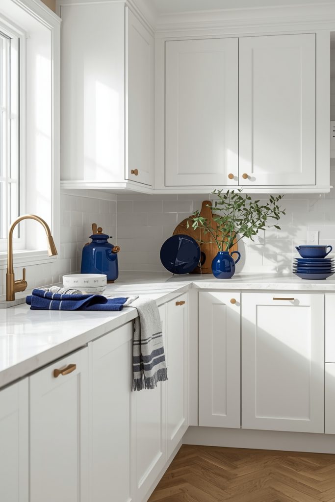
We moved into our rental with a white kitchen and I had no intention of asking the landlord’s permission for anything. But I wanted the blue-and-white palette somewhere in the space. So I started small — a cobalt Lodge cast-iron Dutch oven on the stovetop ($60–$80, performs identically to the Le Creuset at a quarter of the price), a set of blue linen dish towels from IKEA, a deep blue ceramic utensil holder on the counter. The room shifted. Not dramatically, but enough that I stopped walking into the kitchen and feeling nothing.
Thrift stores are genuinely worth a weekly check for blue-and-white ceramic pieces — old Ball canning jars, vintage pressed glass, transferware plates. These come in at $1–$5 per piece and line up on windowsills or open shelves with real visual weight. A single piece of cobalt glassware on a white window ledge catches the light in a way that no other color does quite the same.
The important discipline here is shade consistency. Three objects in the same blue family read as an intentional color story. Eight objects in eight variations of blue just look like you buy a lot of blue things without ever committing to one. Pick a shade — cobalt, navy, dusty slate, pale sky — and bring in every accessory within that same range. Repetition creates the palette. Variety undermines it.
13- Dark blue with light oak flooring
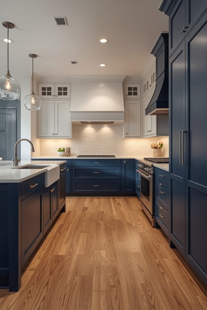
A neighbor three doors down has this combination — deep navy Shaker cabinets over wide-plank white oak flooring — and I’ve stood in that kitchen probably six times just to look at it. The contrast between the cool dark blue above and the warm honey-toned wood below creates a tension that should look wrong and instead looks deliberate and grounded in a way that matching tones never quite achieves.
White oak specifically matters more than just “light wood.” Red oak carries warm orange tones in the grain that fight against the cool undertone of navy blue — the two warm-cool pulls create visual noise. White oak reads warmer and more neutral and sits beside blue naturally. White oak engineered hardwood flooring runs $4–$9 per square foot in material cost, plus $3–$5 per square foot for professional installation on a 150–200 square foot kitchen floor.
White countertops and white-painted walls above the cabinets complete the balance — without those light upper surfaces, the room accumulates too much visual weight at floor and cabinet level. The ceiling and upper walls need to stay bright so the room breathes. White quartz counters at $55–$85 per square foot installed handle this job well and don’t need sealing or special maintenance.
Dark floor plus dark cabinets: Navy cabinets over dark hardwood or slate tile floors make a kitchen feel tunnel-like regardless of how much natural light the room gets. If your floors are dark and you want deep blue cabinets, shift the blue toward a lighter, mid-range shade rather than full navy — or repaint the walls a very bright white to compensate for the combined visual weight below eye level.
14- Painted blue ceiling
Nobody does this. That’s the whole point. I painted my kitchen ceiling pale blue-grey two summers ago — Sherwin-Williams “Watery” (SW 6478, about $65/gallon, one quart covered the ceiling with a coat to spare) — and the number of people who walked in and couldn’t immediately figure out what was different was genuinely entertaining. The room felt different. The ceiling felt higher even though it absolutely wasn’t. It took about four people visiting before anyone looked up and realized what had changed.
Southern American porch traditions have used soft blue-green ceilings — called “haint blue” historically — since the 1800s. The color makes a ceiling appear to recede visually, which creates an outdoor, sky-like feeling overhead. In a kitchen with white cabinets, the blue ceiling adds the color layer without touching any cabinet surface — useful when cabinets are in great condition or when painting them feels like too much commitment.
Benjamin Moore “Palladian Blue” (HC-144, around $70/gallon) and Sherwin-Williams “Watery” both sit in the pale blue-grey range that reads as sky rather than as paint color. One gallon covers a standard kitchen ceiling twice with leftover — this is genuinely one of the lowest-cost renovations available in any room, and the visual payoff is disproportionate to the $30–$35 in paint it costs.
15- Blue pantry or butler’s door
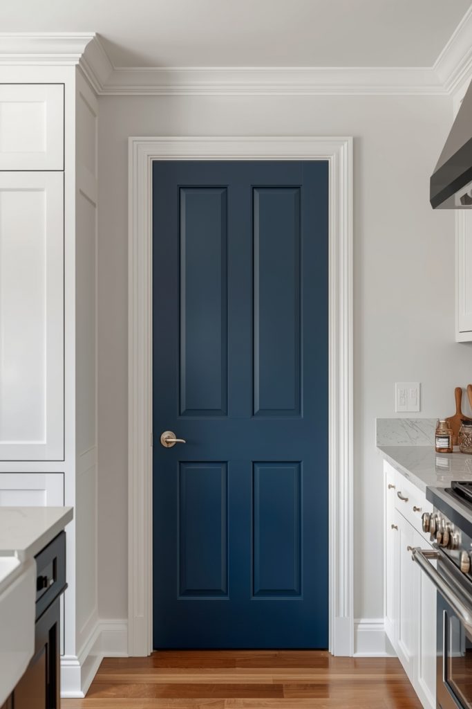
A pantry or butler’s pantry door in a rich saturated blue against an all-white kitchen creates a focal point that costs $30–$50 in paint and one afternoon to execute. No contractor, no cabinet modification, no tenant negotiation in most rental situations since it’s a single door that can be repainted white before move-out. The impact per dollar and per hour spent is higher than almost anything else on this list.
Deep colors that would feel oppressive across an entire cabinet run work well on a single door precisely because the white surroundings absorb the intensity. Benjamin Moore “Blue Note” (2129-30, around $65/gallon) and Sherwin-Williams “Indigo Batik” (SW 7602, around $65/gallon) both deliver the kind of saturated depth that photographs with real presence. A vintage brass doorknob from Etsy at $25–$60 or a matte black lever handle from any hardware store at $15–$30 makes the painted door read as a complete design decision rather than a painted door with leftover hardware.
Paint the interior side of the door the same blue while you have the brush out. When that door swings open — which in a busy kitchen happens constantly — the blue interior visible from the main kitchen space becomes part of the color story rather than a jarring reversal to white. That detail takes ten extra minutes and significantly changes how finished the whole idea looks.
16- Scandinavian-inspired pale blue
Nordic design treats color functionally rather than decoratively — shades exist to interact with light and modify how a space feels through the day rather than to make a bold statement. A Scandinavian-influenced blue and white kitchen uses colors that sit between categories. Not clearly blue, not clearly grey. Somewhere in between, shifting with whatever the light is doing at any given hour.
Benjamin Moore “Gray Cashmere” (2138-60, about $65/gallon) does this mutability well — more blue in morning light, more grey by afternoon, almost silver on overcast days. Farrow & Ball “Mizzle” (266, about $110 per liter) sits in similar territory with more depth. These shades never quite settle on a definitive color, which in Nordic design is the point. Walls and materials are expected to work with light rather than against it.
White shaker cabinet doors, brushed steel or chrome hardware rather than brass, bleached ash or white oak wood accents, and white quartz counters complete the scheme. Nothing competes visually, nothing announces itself loudly, nothing fights for attention. The Swedish concept of “lagom” — roughly translated as just the right amount, never too much — describes the editing principle exactly. When in doubt about whether to add something to this style of kitchen, the correct answer is almost always no.
17- Farmhouse blue with apron sink
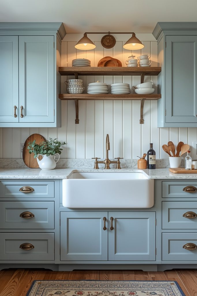
Shaker cabinet doors in a denim or worn navy blue with a big white apron-front sink below them is probably the most photographed version of this whole palette on Pinterest — and it earns that attention because the combination genuinely holds together across different lighting conditions, different kitchen sizes, and different surrounding finishes in a way that more trend-specific kitchen aesthetics don’t.
Benjamin Moore “Newburyport Blue” (HC-155, around $65/gallon) hits the right note here — it reads as a blue that’s been in a farmhouse kitchen for forty years rather than something freshly selected from a current color trend deck. The Shaker profile door style complements this shade specifically because the shadow lines in the routed frame add depth to the color in a way that flat-front doors don’t produce.
Apron-front sinks run from $200 for a basic stainless version to $600–$1,200 for a white fireclay sink from Rohl or Kohler. I have a fireclay one and it chips if you drop a cast iron pan directly into the basin — something I discovered the hard way six months after installation. A stainless version requires different cabinet modification but costs less and handles abuse better. Both work well with blue cabinets; the fireclay just looks more farmhouse-authentic and requires slightly more careful daily use.
18- High-gloss white and deep blue contrast
High-gloss cabinet finishes divide people. My own view: in a blue-and-white combination specifically, the gloss level changes the whole character of the color in a way that matters more than in most other palettes. Gloss white next to gloss deep blue creates a graphic, lacquered quality — almost like an art object rather than a kitchen — that matte finishes in the same colors can’t produce. The reflectivity exaggerates the contrast between the two tones and the result reads as bold and decided.
Achieving a true high-gloss finish on cabinets requires spray application rather than brush-and-roller — the surface shows every roller texture and brush stroke through a high-gloss topcoat. Hiring a cabinet refinishing specialist costs $800–$2,000 for an average kitchen and produces the smoothest result. Semihandmade sells factory-finished flat-panel doors in high-gloss finishes compatible with IKEA SEKTION frames at $75–$150 per door — a mid-range path between DIY painting and full custom cabinetry.
One practical trade-off worth knowing: gloss surfaces show fingerprints considerably more than matte or satin finishes. A gloss blue kitchen cabinet in a household with children or heavy cooking traffic needs daily wiping. In a kitchen that sees light use or belongs to someone without young kids, the maintenance is manageable. In a genuinely busy kitchen, matte dark blue from Idea 6 produces a similar depth of color with far more forgiveness on the daily smudge front.
19- Blue with black line accents
Black in a blue and white kitchen works best as a line element rather than a surface material — hardware, faucet, grout, light fixture frame — where it defines and sharpens the existing colors rather than introducing a third tone that competes for attention. Matte black cabinet pulls on white or pale blue cabinets create a graphic crispness that neither brass nor chrome produces. The contrast is higher and the effect reads as more architectural.
Matte black bar pulls cost $8–$15 each from Amazon or any hardware store. A matte black bridge faucet over a white farmhouse sink — available from Moen, Delta, and Kingston Brass at $150–$350 depending on style — anchors the sink zone in the same language as the hardware. Mapei Flexcolor grout in charcoal or true black costs $20–$30 per bag and turns a plain white subway tile backsplash into something with real graphic definition when laid with consistent grout line width.
This three-tone approach — blue, white, black — suits contemporary and industrial-adjacent kitchen styles far better than it suits farmhouse or coastal versions. A Shaker or beadboard cabinet door with ornamental profile detail doesn’t carry matte black hardware as naturally as a flat-front door does. The style of the cabinet door should guide the hardware choice as much as the color palette does — get that combination right and the whole kitchen reads as cohesive.
Mistakes Worth Knowing Before You Start
I made most of these. A few I watched friends make and managed not to say “I told you so” about.
❌ WHAT ACTUALLY GOES WRONG IN A BLUE AND WHITE KITCHEN
- Choosing the shade from a paint chip without testing it at home. Store lighting runs cool and flat. Your kitchen lighting runs warm and directional. A shade that reads as clean navy on a chip can go almost black or grey-blue entirely under your actual kitchen fixtures. Buy sample pots, paint a swatch on a real cabinet door, observe it across a full day.
- Skipping the warm accent material entirely. All blue and white with no brass hardware, no wood stool, no warm-toned textile — the kitchen reads clinical. That 10% warm element carries disproportionate weight. Without it the palette feels unresolved.
- Dark blue in a kitchen that already struggles with light. North-facing rooms and kitchens with small or few windows need soft, muted blues. Navy in a dark room stays dark all day regardless of how the shade looks in a sun-drenched photo.
- Mismatched gloss levels between cabinets and backsplash. Matte blue cabinets next to a high-gloss tile backsplash creates a tension that’s subtle but immediately noticeable. Keep finish levels consistent across adjacent surfaces.
- Wall paint on cabinet surfaces. Wall paint chips off cabinet edges within months of regular use regardless of primer quality. Use a cabinet-specific product: Benjamin Moore Advance, Sherwin-Williams Emerald Urethane Trim, or Behr Cabinet & Trim Enamel all significantly outperform standard interior paint for this specific application.
- Multiple different shades of blue in one kitchen. Blue lower cabinets in one shade, blue backsplash tile in a slightly different shade, and blue accessories in a third shade looks disjointed. Pick one shade family and carry it consistently, or separate color zones with a substantial white zone between them.
- Ignoring the floor color in the palette decision. Your existing floor is part of the color palette whether you factor it in or not. A warm-toned floor fights cool blue cabinets if the blue leans too cold. Shift the blue toward warmer undertones — denim, dusty slate — or the floor and cabinets will work against each other.
Wrapping up
A blue and white kitchen is one of the few color combinations that stays relevant regardless of what’s trending in a given year — partly because it’s genuinely appealing to look at, partly because the range of interpretations is wide enough that no single version becomes dated the same way a trend-specific kitchen does. Navy farmhouse reads differently from pale Scandinavian, which reads differently from bold cobalt minimalist. All three start from the same two colors and arrive somewhere completely their own.
Test the shade in your actual kitchen in your actual lighting before you commit. Add the warm accent. And check the floor tones before you buy a gallon of anything.
📌 Save this to Pinterest — kitchen projects have a way of starting six months before you think they will and you’ll want a reference. Got a question about a specific shade, finish, or hardware combination? Leave it in the comments. I answer specific questions, not general ones.
Frequently asked questions
What is the best blue paint for kitchen cabinets?
Benjamin Moore Hale Navy (HC-154) in their Advance cabinet formula is the most reliable deep navy for cabinet painting — it levels well, hardens properly, and dries to a rich slightly warm-toned navy rather than the near-black some deeper shades produce. Sherwin-Williams Naval (SW 6244) in Emerald Urethane Trim runs in the same family and leans a fraction warmer. For pale blues, Sherwin-Williams Sea Salt (SW 6204) and Benjamin Moore Boothbay Gray (HC-165) produce nuanced shades that shift subtly with changing light throughout the day. Regardless of brand, always use a cabinet-specific paint formula — standard interior wall paint chips off cabinet edges within months of regular use.
Does a blue and white kitchen date quickly?
The combination stays relevant — blue and white kitchens appear across every design era without becoming associated with a specific decade the way certain trendy kitchen colors do. What ages is the specific shade. Highly saturated, trend-specific blues read immediately as belonging to their moment. Muted navy, dusty denim, aged slate, and soft powder blue hold up across design cycles because they sit closer to the neutral-adjacent end of the spectrum. Choosing toward quieter, more complex shades rather than whatever’s currently trending buys the kitchen significantly more longevity.
How much does it cost to paint kitchen cabinets blue?
DIY repainting costs $200–$500 in materials for an average kitchen — primer, cabinet-specific paint at $60–$88 per gallon, brushes, sandpaper, tape. Time investment is substantial: proper degreasing, sanding, priming, two paint coats, and drying time between each. Professional cabinet refinishing runs $800–$2,500 for the same kitchen. Full cabinet replacement with new doors in your chosen color costs $3,000–$15,000 depending on materials and scope. DIY or professional refinishing provides the best return on investment for most homeowners — full replacement makes financial sense mainly when the cabinet box structures themselves need replacement.
What hardware finish looks best on blue kitchen cabinets?
Brushed brass or antique gold introduces warmth into a cool palette — this is the functional reason to choose it over silver finishes, not just aesthetics. A blue and white kitchen without any warm grounding element reads clinical. Brass hardware handles that problem directly. Matte black works well on contemporary flat-front blue cabinets for a graphic, high-contrast result. Chrome and brushed nickel are safe but contribute no warmth to the palette, which means warmth needs to come from somewhere else — wood flooring, wooden bar stools, or a warm-toned countertop material.
Can I paint kitchen cabinets blue myself without experience?
Yes. Prep work matters far more than painting technique. Remove all doors and drawer fronts first. Degrease every surface with a dedicated kitchen degreaser — cooking residue prevents paint from bonding regardless of how good the primer is. Sand lightly with 220-grit sandpaper. Apply a bonding primer. Then add two coats of a cabinet-specific paint: Benjamin Moore Advance, Sherwin-Williams Emerald Urethane Trim, or Behr Cabinet and Trim Enamel all outperform standard interior paint for durability on cabinet surfaces. Sand lightly between coats with 320-grit for the smoothest finish. Rushing the degreasing and sanding stage is the most common reason DIY cabinet repaints look fine for a few months and then chip along every door edge.
What countertop works best alongside blue kitchen cabinets?
White quartz is the most practical choice — resists staining without sealing, suits every shade of blue from pale powder to deep navy, and provides clean contrast without maintenance demands. Marble or marble-look quartz adds warm grey veining that bridges the color gap between cool blue cabinets and white countertop surfaces naturally. Butcher block costs less than stone and works well alongside coastal and farmhouse-style blue kitchens specifically. Avoid pairing dark countertops with dark navy cabinets unless the kitchen receives excellent natural light and has bright white-painted walls above the cabinet line to compensate.