Let me be honest with you. I spent three weekends staring at my living room floor before I finally did something about it. The rug I had was fine. Technically fine. The kind of rug that does nothing wrong and also does absolutely nothing right. Beige. Forgettable. Safe in the worst possible way.
Then I found a dusty rose rug at a small home store and bought it on a Tuesday afternoon without telling my partner. He came home, looked at the floor, and said nothing for a solid ten seconds. Then he sat down on the couch and said, okay yeah, that actually works.
That was three years ago. I have not looked back.
Pink rugs have this reputation problem. People hear pink rug and immediately picture a little girl’s bedroom with butterfly decals on the wall. And sure, pink works there too. But pink also works in a grown man’s study, a neutral Scandinavian living room, a boho apartment with plants everywhere, and a sleek modern dining room. Pink is one of those colors that people underestimate until they see it in person. Then they get it.
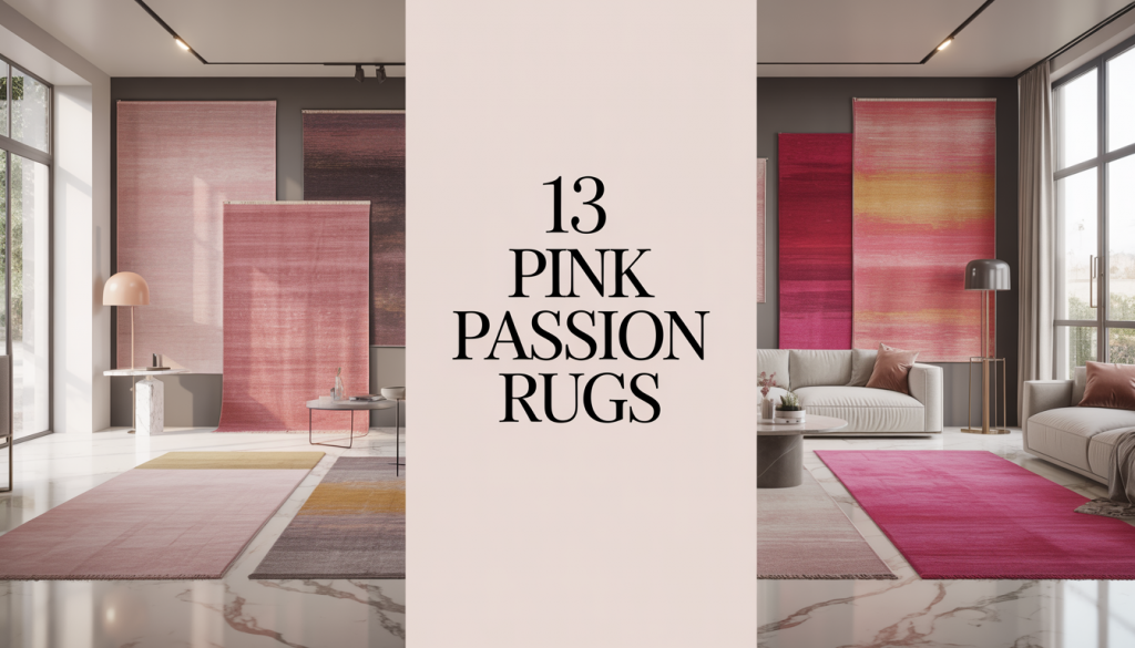
13 Pink Passion Rugs
So I put together this list of 13 pink passion rugs because there is no single pink rug. There are about a dozen different personalities hiding inside that one color, and picking the wrong one for your space is genuinely easy to do. Picking the right one though? That changes a room in a way that furniture never quite manages.
Here we go.
01- The Blush Pink Area Rug
Blush is where most people start, and honestly, it is a solid first move. It is the most forgiving shade of pink. In low light it reads almost like a warm cream. When afternoon sun hits it, suddenly your whole room has this soft rosy glow that feels expensive without costing a lot.
The thing about a blush pink area rug is that it works with almost anything. Cream sofa? Yes. Gray sectional? Also yes. White walls? Absolutely. Dark wood floors? That contrast is actually stunning.
Where it works best: Living rooms and bedrooms, no contest. In a living room, go for an 8×10 or 9×12. Put the front legs of your sofa on the rug and leave about 18 inches of bare floor around the edges. That framing effect makes the whole room feel intentional.
One thing to check before ordering: blush comes in warm and cool versions. Warm blush has peachy undertones. Cool blush leans slightly lavender. This sounds like a minor detail until you put a cool blush rug in a warm amber-toned room and they fight each other all day. Match the undertone to what you already have.
Biggest mistake people make: buying a size too small to save money. A tiny blush rug in a big room looks like it got lost. Size up and trust the decision.
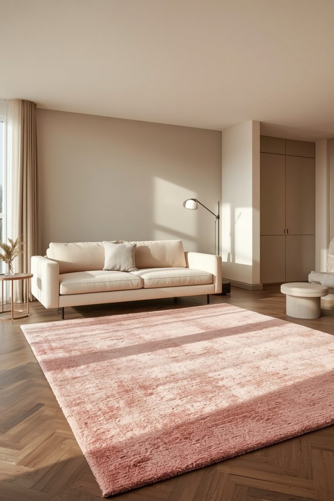
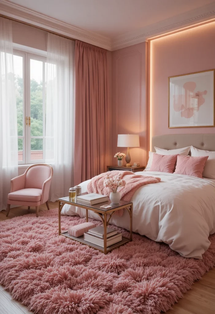
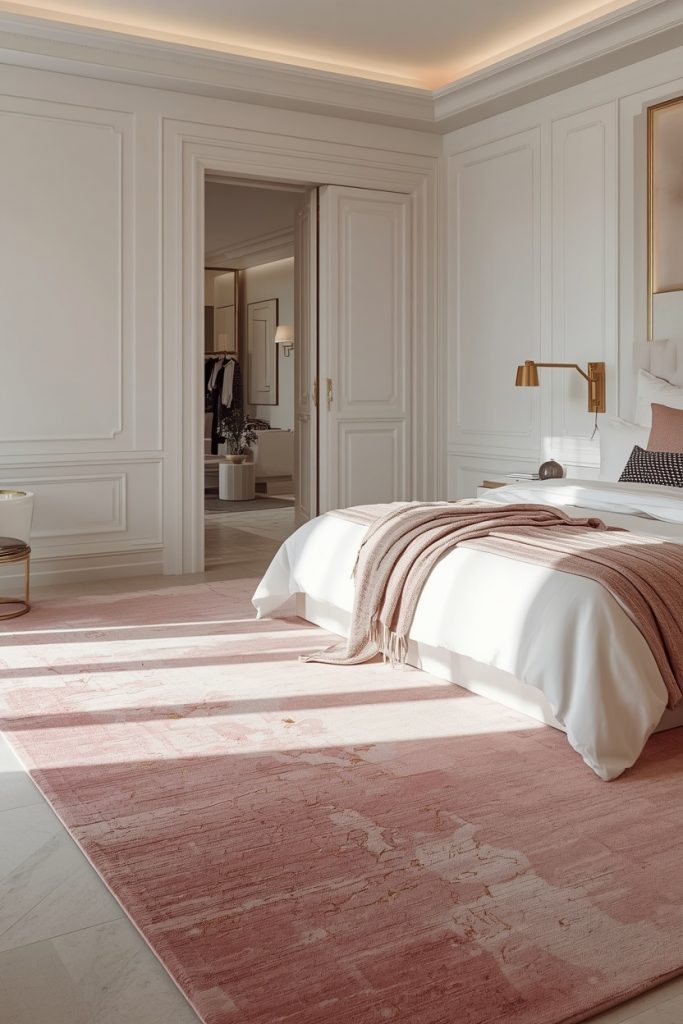
02- The Dusty Rose Rug for Living Rooms
Dusty rose is what blush looks like after it has lived a little. It is muted, slightly gray, and it carries this vintage weight that blush does not. If you have ever seen a beautiful old French farmhouse interior and felt something in your chest, dusty rose was probably on the floor.
This shade is having a serious moment in interior design right now, and the reason is simple: it works in multiple styles without trying too hard. Bohemian rooms love it. Mid-century modern rooms love it. Traditional spaces love it. It is genuinely versatile in a way that hot pink will never be.
Where it works best: Living rooms with earth tones, dining rooms, and cozy reading corners. Under a round dining table, a round dusty rose rug in an 8-foot diameter looks stunning. Especially with walnut furniture and simple white chairs.
What to put around it: Terracotta accents, sage green throw pillows, rattan side tables, and warm wood tones. Dusty rose and terracotta together look like they belong in an interior design magazine. I say this as someone who has that exact combination in my own dining room.
What kills the look: Pairing dusty rose with cool gray walls. The combination goes flat. Warm white or cream walls make dusty rose sing. Cool gray walls make it disappear.
03- The Fuchsia Rug
Okay. Deep breath. Fuchsia.
This is not for everyone and it knows it. A fuchsia rug in a room is a mood, a statement, and a personality test all at once. If you pick fuchsia, you are telling everyone who walks through your door something about yourself. Usually something good.
The secret to making fuchsia work is leaving everything else alone. Fuchsia does not need help. It does not want company. Give it white walls, a simple cream sofa, maybe some light wood furniture, and then get out of the way. The rug handles the rest.
Where it works best: Entryways are incredible for fuchsia. A fuchsia runner down a hallway is the kind of thing that makes people stop walking and look down. Living rooms with completely neutral backdrops also work well. Home offices, weirdly, are great for fuchsia because it keeps your energy up during a long workday.
Size note: In a living room, stay at 5×8 or 8×10. Too much fuchsia across a giant floor tips from bold into overwhelming. Use it as a punch of color, not a full coverage situation.
What wrecks it: Competing colors. Fuchsia and orange do not get along. Fuchsia and red actively argue. Keep everything else quiet and let this rug be the loudest thing in the room.
04- The Rose Pink Rug for Bedrooms
Here is something I think about more than is probably normal: the first thing your feet touch in the morning matters.
You step off the bed, your eyes are barely open, and the floor is either cold and hard or it is soft and warm and a color that makes you feel good. A rose pink rug for your bedroom is the second option. It is genuinely one of the nicest things you can do for yourself on a daily basis.
Rose pink sits between blush and dusty rose. It has more depth than blush so it reads as a real color, but it is softer than dusty rose so it stays calm. In a bedroom, that balance is exactly right.
Where to put it: Under the bed, extended 18 to 24 inches on each side and at the foot. For a queen bed, that means an 8×10 rug minimum. For a king, go 9×12. Two-thirds of the rug goes under the frame. When you step off the mattress, your feet land on it.
What to put with it: White or cream bedding. Navy or sage green throw pillows for contrast. Natural wood headboards or white painted ones. Simple linen curtains. The bedroom should feel calm around the rug, not busy.
Pile height matters here: Do not go low pile in a bedroom. You want something soft enough that stepping onto it in the morning feels like a small reward. Medium pile or higher. This is not negotiable.
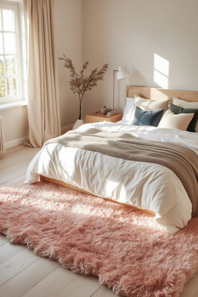
05- The Pink Shag Rug
I need to say something about pink shag rugs that nobody else seems willing to say: they are absurdly fun to own.
There is no practical reason to justify a pink shag rug. It is not the most durable option. It is not the easiest to clean. It is not the most versatile. But stepping barefoot onto a plush pink shag rug at the end of a bad day? That fixes things. At least a little.
Blush shag feels romantic. Hot pink shag feels playful in a way that makes guests smile. Dusty rose shag manages to feel sophisticated despite being, let us be clear, a fluffy pink rug. Pick the shade that matches your energy.
Where it works best: Bedrooms and living rooms. In a teen bedroom or a girl’s room, a blush or hot pink shag rug is the single biggest visual upgrade you can make. In a living room, a dusty rose shag under a coffee table with a simple glass surface on top is one of those combinations that always looks great in photos.
The honest truth about shag rugs: they do not belong in high-traffic areas. The pile flattens under constant foot traffic and then it looks sad. Keep shag rugs where people slow down, sit, and stay for a while.
You may also like: 30 Cozy Small Studio Apartment Ideas – 11 Aesthetic Living Room Decor Ideas That’ll Make You Actually Love – 23 Green and Beige Living Room Designs
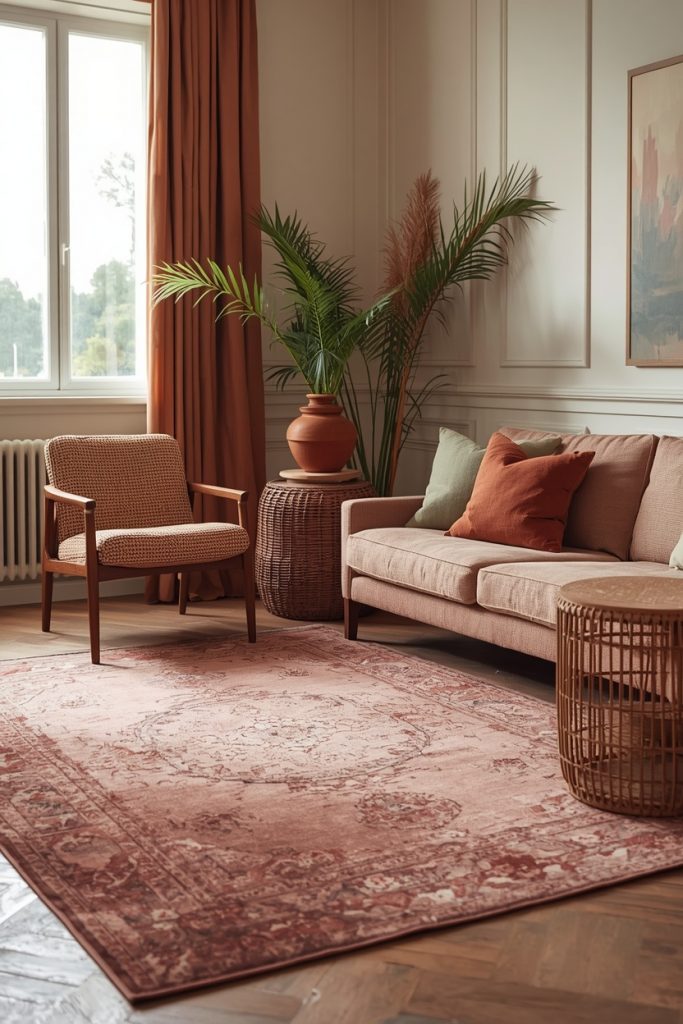
06- The Vintage Pink Rug
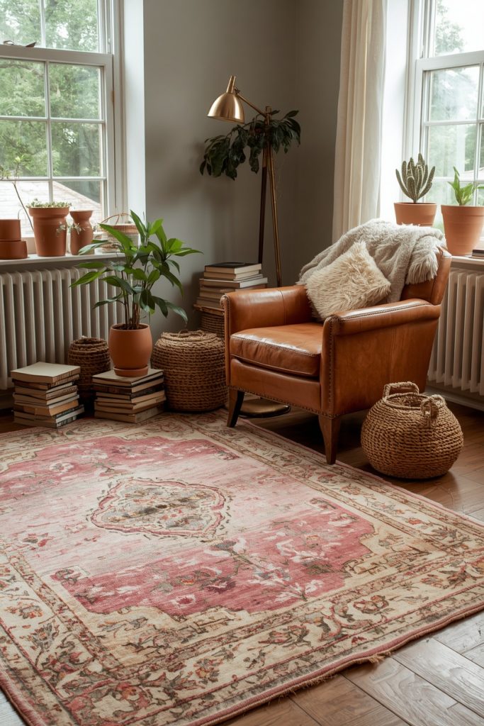
There is a version of a pink rug that looks like it has been living in a beautiful house for fifty years and has wonderful stories to tell. That is the vintage pink rug. The colors are faded. The pattern has that hand-worn quality. And somehow it looks more interesting than anything brand new.
Vintage pink usually comes in dusty rose, faded coral, or muted mauve. The aging process works in the rug’s favor because the fading creates this depth and softness that new rugs spend a lot of effort trying to fake.
Where it works best: Living rooms, reading corners, and layered on top of a large natural fiber rug. That layering trick is worth trying. Put a jute or sisal rug down first. Then place the vintage pink rug on top, slightly off-center. It looks collected and intentional even though it took about five minutes to arrange.
What to put around it: Terracotta pots with plants, leather armchairs in camel or cognac, antique brass lamps, stacked linen books. The vintage pink rug belongs in a room that looks like you actually live in it.
What to avoid: Filling the rest of the room with other busy patterns. Vintage rugs usually carry their own detail. Give them open space and simple furniture so the rug stays the focus.
07- The Pink Persian Rug
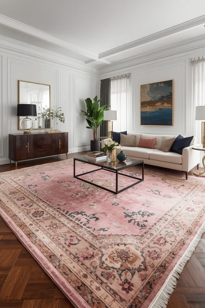
A pink Persian rug is not a decorating choice. It is more like an investment in the character of a room.
The intricate medallion patterns, the layered border detailing, the way rose and blush tones weave through the design alongside cream, navy, or deep green, all of it adds up to something that looks genuinely considered. A pink Persian rug makes a room feel like someone with taste lived in it for a long time.
The surprising thing about pink Persian rugs is that they work in modern spaces. Against a clean white wall with simple modern furniture, a pink Persian rug becomes a piece of art on the floor. It provides all the visual complexity the room needs and then you do not have to do anything else.
Where it works best: Formal living rooms, dining rooms, master bedrooms, and studies. Under a dark walnut dining table with simple white chairs, a pink Persian rug is genuinely breathtaking.
What to put with it: Deep jewel tones. Emerald green, navy, burgundy. Brass and gold fixtures. Keep the walls neutral so the rug stays the thing your eyes go to first.
The size rule for Persian rugs: Go larger than you think you need. 8×10 minimum in a living room. 9×12 for a dining room. Persian rugs look best when they have room to exist fully.
08- The Boho Pink Rug
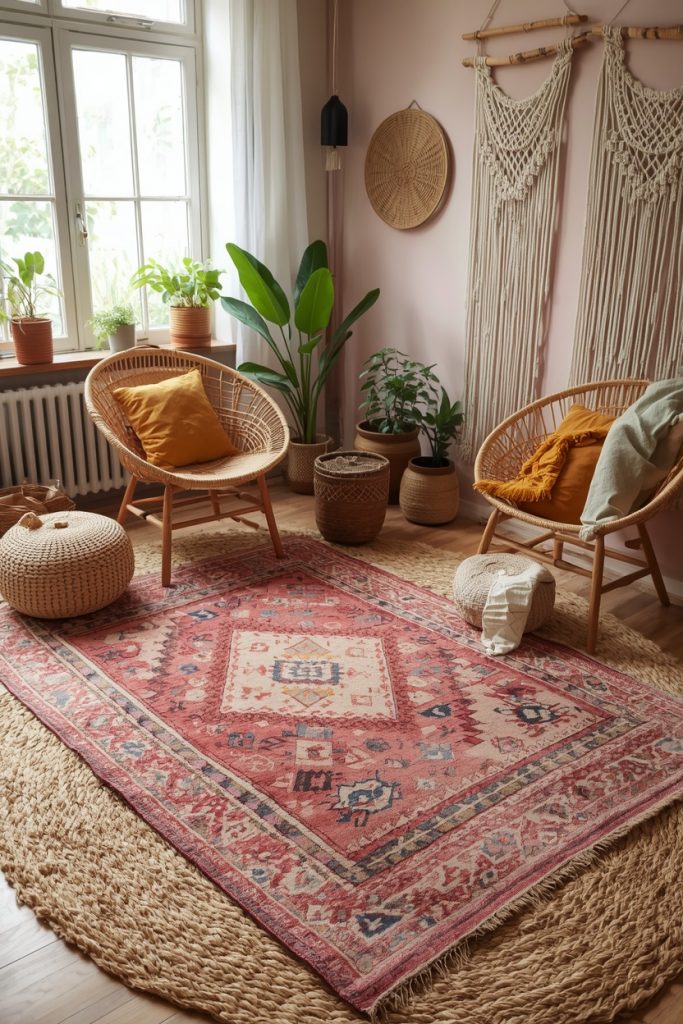
Boho interiors work on a principle that most design rules discourage: more is more, as long as the colors share warmth. A boho pink rug fits into that world without any adjustment period.
These rugs usually come in kilim patterns, tribal prints, or flatweave styles. The pink shades lean toward faded coral, terracotta-adjacent rose, and warm dusty tones. They look handmade. Many are. That handmade quality is exactly what makes them work in a boho space.
Where it works best: Living rooms, studio apartments, outdoor patios, and bedroom floors. The layering trick works especially well here. Put a large jute rug down first, then the boho pink rug on top. Choose the jute two sizes larger so the pink rug sits visibly inside it with clear borders on all sides.
What to put around it: Macrame wall hangings. Rattan chairs and side tables. Indoor plants in terracotta pots. Woven baskets. Patterned throw pillows in mustard yellow and sage green. The goal is warmth in every direction.
One important note: Boho design runs warm. A cool-toned lavender pink in a boho room looks wrong immediately. Stick to warm rose, coral pink, or terracotta pink tones. If the rug has a warm peachy base, you are in the right territory.
09- The Pink Geometric Rug
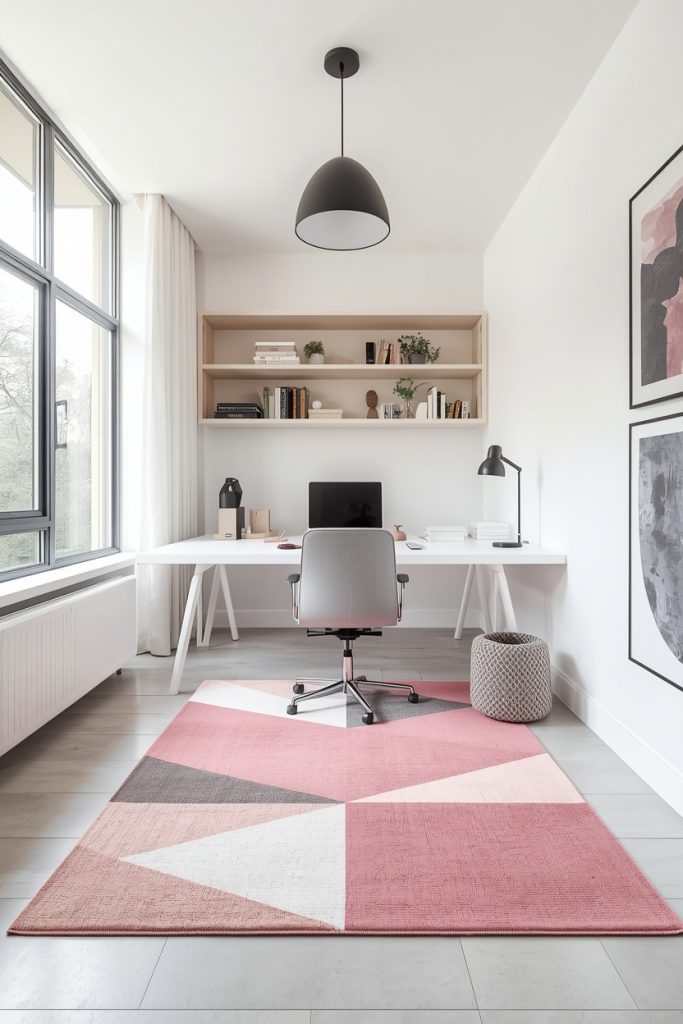
This one is for the person who loves pink but wants the room to feel modern and graphic rather than soft and romantic. Pink geometric rugs take the warmth of the color and put it inside a clean, structured pattern. Diamonds, chevrons, hexagons, abstract angular shapes. The result feels contemporary and personal at the same time.
Where it works best: Home offices are genuinely excellent for pink geometric rugs. The pattern gives visual interest without being distracting, and the pink keeps the energy up without feeling heavy. Modern living rooms, teen bedrooms, and minimalist spaces also work well.
What to put with it: Clean-lined furniture. White or light gray walls. Open shelving. Simple pendant lights. The rug provides all the pattern the room needs, so everything else should stay quiet and simple.
The rule to follow: One geometric element per room. If the rug is geometric, keep pillows, curtains, and upholstery in solids or subtle textures. Two competing geometric patterns in the same room create visual noise, not visual interest.
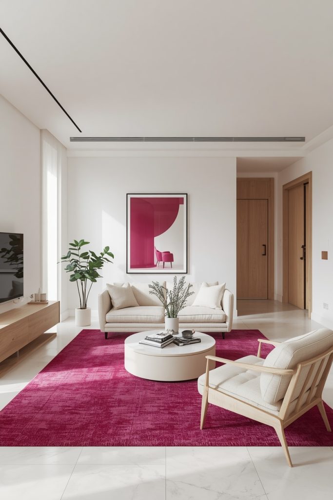
10- The Hot Pink Accent Rug
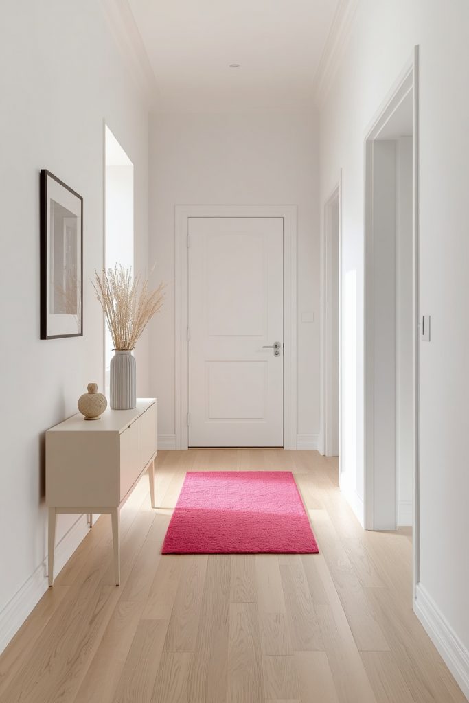
Sometimes a room does not need a whole new rug. It needs one specific spot of color that changes how the whole room reads. A hot pink accent rug does exactly that job.
These smaller rugs, typically 2×3 or 3×5, work by creating a focal point. They tell your eye where to look. And because they are small, the boldness of hot pink does not overwhelm the room, it just wakes it up.
Where it works best: Entryways are perfect. A hot pink accent rug in an otherwise neutral entryway greets every single person who comes through your front door. Also excellent: beside a reading chair, at the foot of a bed in a neutral bedroom, in a bathroom with white tile, or in a kitchen near the island.
What to put around it: Nothing bold. The entire point of a hot pink accent rug is that it becomes the bold thing. Neutral walls, cream or white furniture, natural wood, simple light fixtures. The rug does the work.
What ruins it: Putting a hot pink accent rug in an already busy room. It needs quiet surroundings to pop. Put it in a colorful multi-tone room and the whole thing becomes chaos.
11- The Pale Pink Washable Rug
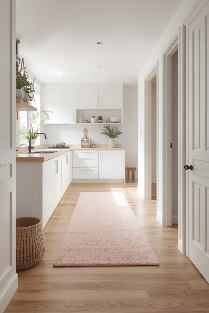
Let me be real with you about something. Beautiful rugs and real life are sometimes in conflict. Dogs happen. Children happen. Red wine on a Tuesday happens. A pale pink washable rug solves all of this.
Today’s washable rugs in pale pink use materials like chenille, recycled PET fibers, or polypropylene in finishes that look soft and high-quality but handle a full cycle in the washing machine without fading, warping, or looking terrible afterward. The technology has genuinely improved in recent years. These are not the scratchy plasticky washable rugs from ten years ago.
Where it works best: Kitchens, entryways, kids rooms, nurseries, and pet areas. Basically anywhere real life happens. A pale pink washable runner in a 2.5×7 or 2.5×10 along the main kitchen work area is one of those additions that makes the room feel softer without creating any stress about maintenance.
What to put with it: Almost anything. Pale pink washable rugs are soft and flexible in tone, so they pair with white cabinetry, natural wood floors, nursery furniture in white or natural tones, and playroom decor in any color palette.
Maintenance tip nobody tells you: Vacuum regularly and only machine wash when there is an actual mess. Washing too frequently breaks down fibers faster than dirt does. A well-vacuumed washable rug stays looking good much longer than one that gets washed weekly.
12- The Pink Rug for Nurseries
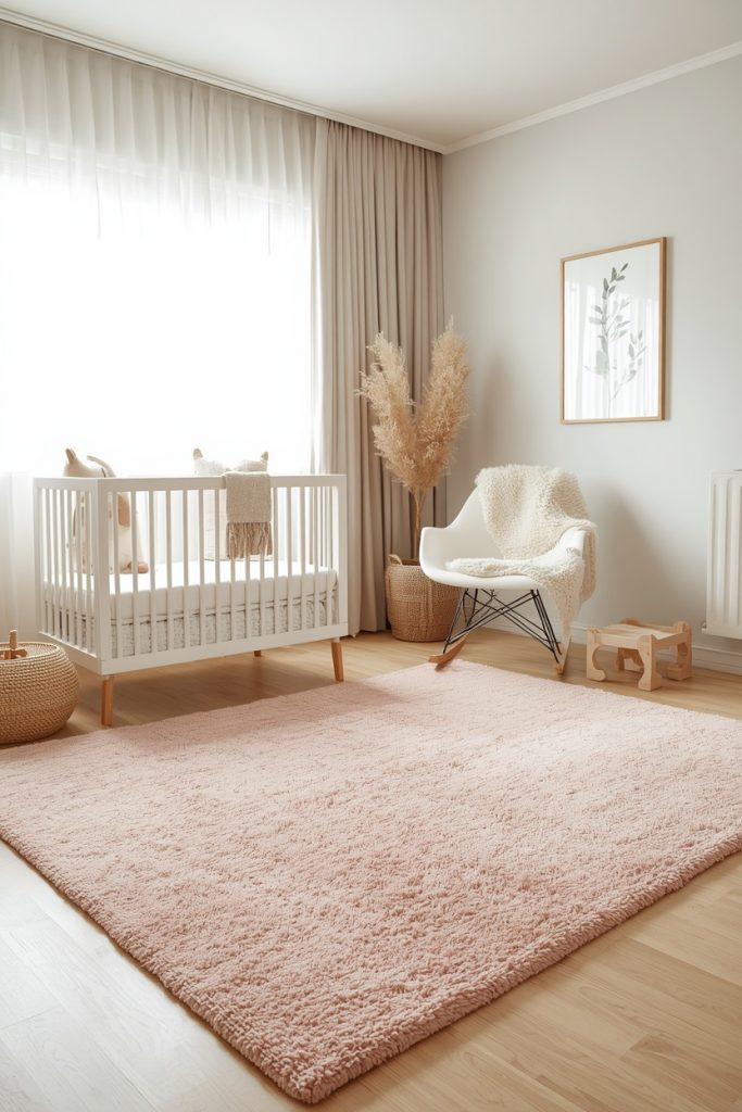
This one feels different to write about. A nursery rug is not just a design choice. It is something your child will have first memories near. You will sit on it reading the same book for the forty-seventh time. You will do tummy time there. You will probably cry on it at least once during a midnight feeding, and you will also probably laugh on it more times than you can count.
A pink rug for a nursery does not have to be overwhelmingly pink. Pale blush with a simple pattern, soft mauve in a solid plush texture, or dusty rose with a subtle botanical print all create warm and nurturing spaces without screaming pink at full volume. These tones also work in gender-neutral nurseries paired with sage green and warm white.
Where to put it: Center of the nursery floor, large enough to define the main play and feeding area. Put the glider or rocking chair partially on the rug so feeding sessions happen inside that defined cozy zone.
Size: For a standard nursery, 5×8 works. If your baby will have more open floor space for playing and crawling, go 6×9 or 8×10.
The one thing to get right: Do not choose a high pile or shag rug for a nursery. Long fibers collect dust and allergens fast. They also hide small toys and objects that become hazards once babies start moving. Low to medium pile cleans easily and keeps the floor safe.
13- The Pink and Gold Rug
This is the one you buy when you want a room to feel like it was designed on purpose. Pink and gold together have this romantic, editorial quality that reads as genuinely expensive. Whether the gold comes through woven metallic threads, a gilded border detail, or gold tones worked into the pattern, the combination elevates a room in a way that most single-color rugs cannot.
Where it works best: Master bedrooms and formal living rooms are ideal. Dining rooms with a chandelier overhead and white chairs around the table? A pink and gold rug under that setup looks extraordinary. Dressing rooms and reading rooms with brass fixtures also work beautifully.
What to put around it: White backgrounds. Brass or gold light fixtures, one or two, not many. Velvet throw pillows in blush or ivory. Minimal clutter. This rug rewards restraint. The more space you give it, the more it delivers.
The rule with gold: If the rug already has gold tones in it, limit metallics elsewhere to one or two pieces. One brass lamp, one gold mirror frame. Stop there. Too much gold in the same room becomes heavy instead of elegant.
How to Pick the Right One Without Second-Guessing Yourself
Four things to work through before you buy:
First, identify your room’s undertone. Warm rooms with wood, leather, and cream need warm pinks. Blush, rose, dusty rose, terracotta pink. Cool rooms with gray, white, and chrome fixtures suit cooler pinks. Pale blush, mauve, lavender-pink.
Second, match pile height to your lifestyle. High-traffic spaces need low pile or flatweave. Bedrooms and lounging areas deserve medium to high pile. Nurseries and kids rooms need low pile for safety and easy cleaning.
Third, choose size deliberately. Measure the room and furniture before ordering. Use the 18-inch rule in living rooms and bedrooms: leave 18 inches of bare floor between the rug edge and the wall. When in doubt, size up.
Fourth, order a sample when the option exists. Pink looks completely different on a screen versus in your actual room with your actual lighting. A free sample shipped to your door takes three days and saves you from a return.
Mistakes Worth Knowing About Before You Order
Going one size too small to save money is the most common regret I hear. A small rug in a large room looks accidental and awkward. The visual payoff of the right size is worth the extra cost every time.
Skipping the rug pad is the second most common mistake. Without a non-slip pad, a rug slides, buckles at the edges, and creates a trip hazard on hard floors. Buy the rug pad at the same time as the rug. Your floors and your shins will thank you.
Trusting the photo too much is third. Online rug photography tends to oversaturate colors. Always read the detailed product description and look for the specific color name or code before committing to a large purchase.
Ignoring undertones is fourth. It sounds like a small thing until you bring the rug home and feel that low-grade sense of wrongness you cannot quite explain. That wrongness is almost always a tone mismatch. Check undertones first.
One Last Thing
My dusty rose rug is still in the living room. Still the right call. My partner has since said, unprompted, that it is one of his favorite things in the house. Which I take full credit for.
A pink passion rug changes how a room feels before anyone consciously notices what changed. People sit down, relax a little faster, and feel more comfortable. The floor, which most people completely forget about when decorating, turns out to be doing a lot of quiet work all along.
Pick the shade that fits your space, put it in the right room, size it correctly, and then let it do what pink does best. Make people feel something without quite knowing why.